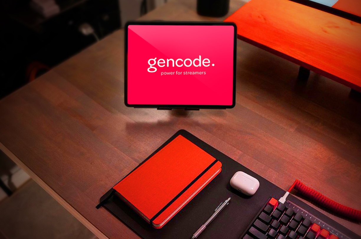
Gencode Brand

Gencode is a video encoding service in the cloud. It powers companies and fast-growing startups to encode on-demand content in a breeze.

Gencode was an early-stage startup with an ambitious vision: to build the next-generation cloud encoding. From the beginning, they knew that design is not a requirement, it’s a strategical asset. It was clear that they needed a strong brand presence to gain market share and compete.

I started helping them as a freelance design consultant early on. I helped to define design principles for the conception of the new brand. Designed their visual identity and participated in the initial research of the product development.

Brand development

Visual language is about communication, a systematic model for sharing ideas and sentiments through common understanding. As a product or team grows, the challenges within maintaining cohesive communication also increase.

Anticipating the company’s growth, I advised developing an engaged and handy design language. A standard system to promote efficient communication through reusable and well-defined components.

Philosophy

When I started to think about how to visually represent a product that is essentially a bunch of application programming interfaces (APIs) and computing power to convert videos, it comes to mind what Paul Rand once said. 

Without aesthetics, the computer is a mindless speed machine, producing effects without substance, form without relevant content, or content without meaningful form.

Aesthetic is the philosophy ruling outer appearance and actions. Applying this mindset to any experience is essential to its effectiveness.

Everything we do communicates. The meaning we put into every experience is what the brand should expect in return. Lead, facilitate, liberate, simplify, move forward into the future is the Gencode core values, and so it should be his brand.

Terraforming

One major challenge during this project was translating the abstract concept of “cloud encoding” into a tangible, relatable visual language. I overcame this by researching extensively, brainstorming, and experimenting.

I created a library of aesthetical representations of the abstract brand aspects in a visual language, terraforming the field for a design system. Below is the result of many iterations of testing and feedback of my visual experiments.

The freedom of a visual language abstract in forms and philosophy becomes a challenge to systematize it. Which means defining replicable rules and techniques. I cared to draw using vectors and mesh gradients, allowing the graphic elements to be editable and scalable.

I designed a system that has defined rules for combining graphic elements with backgrounds and how they come together in compositions. Hierarchy, scale, proportion, harmony, and rhythm were rules that defined how each element is arranged in a given space with the essentials to achieve the Gencode brand signature.

With asymmetry, contrast, and suggestion of motion, the language communicates simplicity and dynamism. Creative mixtures form unique and vibrant visuals, guided by a hierarchical system, natural for an engineering startup. Places, sizes, or styles always belong to contexts of a broader system.

Skeleton

I began pondering about how to address concrete communication needs. Incorporate the language with interface elements and functionality on a page. Systematize the visual language in the presentation of information so designers can understand and use it easily. Develop the information design to glue and hold all components.

Using wireframes, I explored the relationships between elements as micro-level information architecture. I researched the real needs of designers, such as usual goals and tasks, and developed templates to validate their use.

I ended up with a cards system that allows designers to compose pages as building blocks, applying those templates in a grid.

These cards had distinct functionality and rules for applying the visual language. For example, cards that worked as a call to action (CTA) should use visual language, as in a hero header. Cards with higher information density, such as text in columns to explain features, should apply plain color backgrounds and so on.

I’m a coding designer, which allows me to think end-to-end about components. The image above illustrates the process. I programmed the cards as responsive React components (click the image above to zoom in), with customizable properties that addressed function and aesthetics.

Implementation

For me, a design system is not just a style guide. Each component must have a function and must have its corresponding in code. In a cross-functional team, communication defines agile work, not just the methodology. 

When a designer chooses a component from a repository to create a prototype, he must have confidence that a developer can implement it.

Below are examples of these cards assembling landings pages.

The design system created a conveyed knowledge of Gencode visual language and a powerful communication tool. It allowed high fidelity prototyping and experimentation faster and cheaper. Also, speed up front-end implementation with coded-ready components. 

Reflecting on this project, I realized the immense value of comprehensive research and user feedback in design. The ability to remain flexible and open-minded in the face of abstract challenges can lead to innovative solutions. In this project, I was reminded of how significant aesthetics are to enhancing usability. 

See other case studies

Gencode Product

CME Mobile Channel

ShareTw.Fb.Pin.
...

This is a unique website which will require a more modern browser to work!

Please upgrade today!