The Chicago Mercantile Exchange is the world’s leading and most diverse derivatives marketplace. CME has always created growth through innovations, increasing its global distribution capacity through multiple platforms.
Role — Designer, Mobile Developer Year — 2010
Context
CME was a pioneer in introducing innovations such as the telephony trade and the electronic wallboard, showing price information around the world instantly. When the internet exploded, CME introduced its electronic trading system, creating unprecedented accessibility by allowing customers to trade their orders directly.
In 2007 a new disruptor appeared. Mobile devices have become part of customers’ lives and have changed how they communicate, interact, and do business.
Strategy
At CME, innovation has always been a strategic driving force, and we wanted to align with this principle. For the mobile channel, we had a vision that we were producing an innovation similar to the introduction of the wallboard or electronic trading.
The challenge
Our teams’ goal was to bring real-time information into customers’ pockets. Those customers included banks, hedge funds, and retail investors that would use this information to manage their risks, inform their investment strategies, and guide business decision-making.
Our success criteria, which became a metric, was to provide a clear information architecture to easy access frequent, accurate, and reliable market data.
So, how might we synthesize a complex set of products and services on such a small screen? How might we keep the same great experience that CME’s customers are used to in this new channel?
User needs
I participated with the UX research team in interviews with economists, brokers, investors, and trade experts with a total of 28 persons to discover the needs for the mobile channel. In addition, we analyzed a lot of data from the digital trade platform and the CME website.
We also did an online survey with more than a thousand people from the CME customer base. Using the quantitative and qualitative data from interviews and surveys, we defined corporative personas to understand industry niches and target group personas to empathize with their needs.
Key takeaways: — Users wanted to watch how their assets perform with transparency. — Users prefer simplified real-time graphs over extensive reports. — Users wanted access to curated market insights and economic research.
Structure
To understand the extent of the content, I drew a map with all the information and functionality available on the CME website. Then taking into account the developed personas and their needs, we collectively decide what to include in the application, what to discard, and how to integrate it into the information architecture.
I challenged the group to remember features and content without consulting the website. If something was missing, we ask ourselves if these contents must be on the mobile app, generating further discussions.
Information architecture
The information architecture map provided a visual understanding of the navigational structure and the hierarchy of features and contents. We designed different flows for each group of users we discovered. We were able to identify the users’ journeys that needed improvement and developed mockups accordingly.
We tested the app information architecture with potential users to ensure an intuitive experience. Using the tree-testing technique, we give them relevant tasks like: Where would you access to mount your portfolio of assets? Over each iteration, we used the test results to adjust and refine the navigation and the hierarchy.
Skeleton
I designed the app’s skeleton using wireframes to find the harmony between technical constraints and usability. The idea was to optimize the placement of elements such as buttons, charts, photos, and text, creating intuitive patterns in the mobile experience. Also, meet technical requirements for native iOS and Android development.
Prototypes
We designed touchable mid and high-fidelity prototypes to quickly and cheaply test the user interface. The tests results revealed minor oversights in the UI structure in some flows and interactions. The feedback from users uncovered some questions, which led to further improvement of the interfaces.
Surface
Style guide
CME had a consolidated visual foundation from the brand style guide already implemented in the website user interface. Cross-functional teams were using components as interactive charts and navigation menus with this visual language.
Since the beginning, I knew that we had to align to that visual style and extend it to the mobile channel, designing the app rooted in solid brand foundations.
Visual design
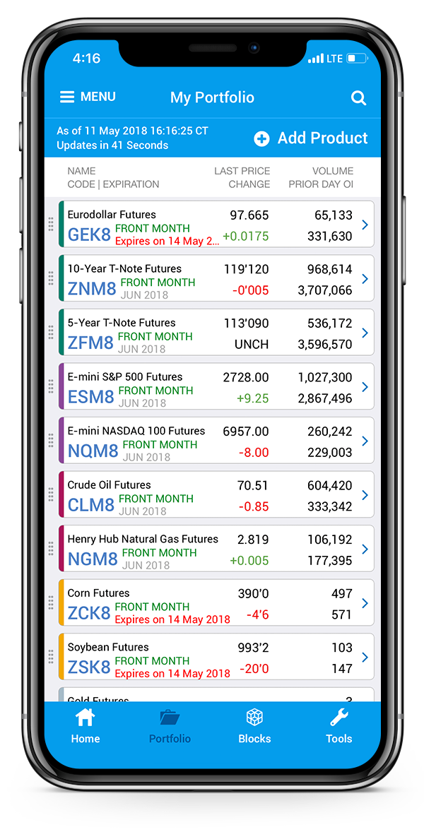
The final visuals shine at the surface of all the phases before it. Simple navigation by a global menu with quick access to the most used features. Customizable portfolio with simplified graphics and a drill-down style navigation to reveal more details. And daily market insights and curated content as a video library and economic research.
Usability tests
At CME, continuous development tests are carried out by QA teams and then usability tests like A/B and click tests with the participation of designers in an agile approach. Teams understand releases as experiments and not finished features. Since the initial release, the app has been improved based on users’ feedback many times.
Outcome
While financial trading influences the world at a macro level, it also impacts individuals daily. CME’s mobile channel growth numbers continue to impress, the adoption was exponential and above expectations.
In the end, we were short in our vision. Bringing information into customers’ pockets was not a transformation similar to that of the wallboard. It was an important chapter in the history of the CME, which is also the history of global trade.